Meet Kodixodel
Kodixodel
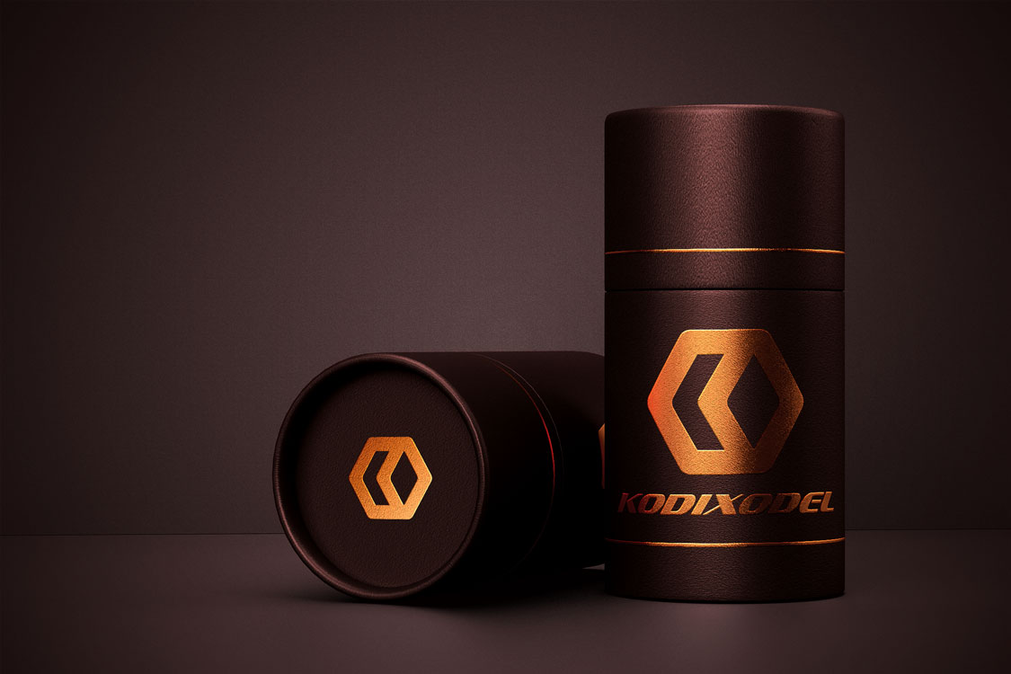
Parag Pentachem Pvt. Ltd. was searching for a face for its PVC stabilizers and Lubricants product, KODIXODEL that would reflect at par with the strong lineage of the mother company. The agency Net Dunes has developed the logo of the brand. The logo reflect the continuity of the company and the top quality of the brand in terms of the quality and market share. The logo itself projects bodings of the products with the markets and the company. It reflect the premium status of the brand.
Power of Human Imagination
The company wanted the agency to develop a logo for the brand KODIXODEL that would reflect continuous and premium quality service for over decades. The logo also projects the bonding factors of the product and the quality as well. The assignment has been covered, using the supreme minds to provide the shine of best the quality.
Engineering a New Tomorrow
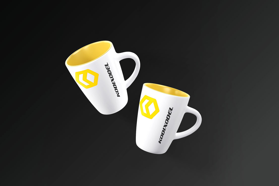
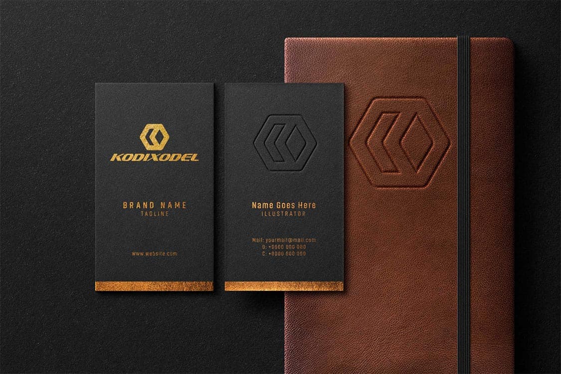
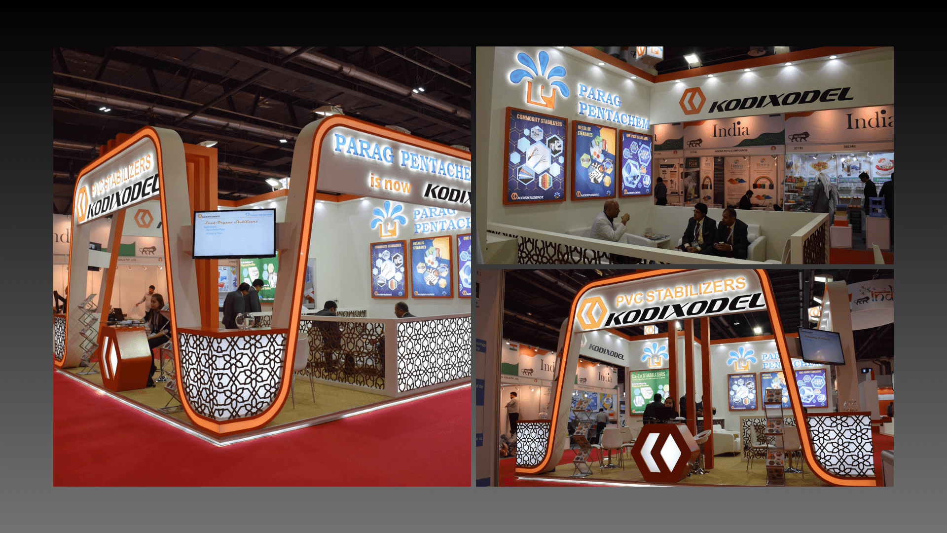
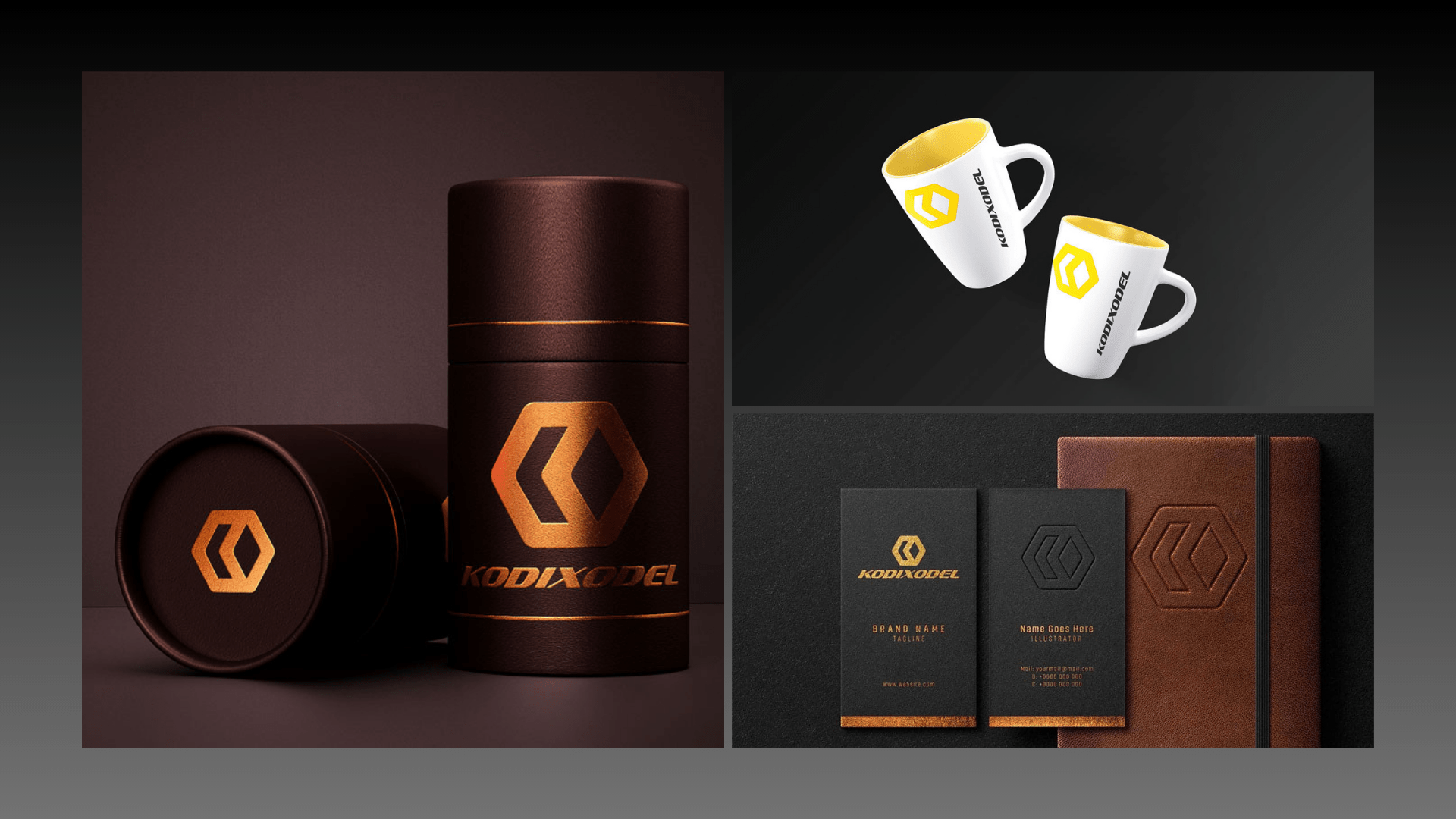
Net Duns developed the Logo for KODIXODEL to bring the upper quality of the brand and how it works. As the face of the brand, the agency has developed the logo in a way that chemical boding can be projected, as that is the core work area of the product. It has a compact view from distant viewing for better recognition. The two hands of K stands for the initial of the brand and founder. It is visible and adaptable on different textures too. Net Dunes has developed the logo, which is a Bonding of K.
Developed to Contribute
- With the introduction of the logo the brand has got its identity and people have started linking it with the established and standing business.
- Whenever the employees from the brand formally communicate, a standard brand image is disseminated to its stakeholders.
- As a soft power of the brand, it penetrates in the markets and minds of the people each time, as the marketing collaterals with KODIXODEL logo on it make their way.
Client:
Category:
Branding & Identity
Date:
November 15, 2017